Exo Security Branding
Exo Security entered a crowded cybersecurity market where most competitors rely on fear-based messaging, tehcnical jargon, and corporate visual systems. I saw an opportunity to build something different, a brand that treated internet security as a normal part of everyday life instead of a constant emergency.
Services:
Brand Identity
Strategy & Positioning
Tone of Voice
Website Design
Strategy & Positioning
Tone of Voice
Website Design
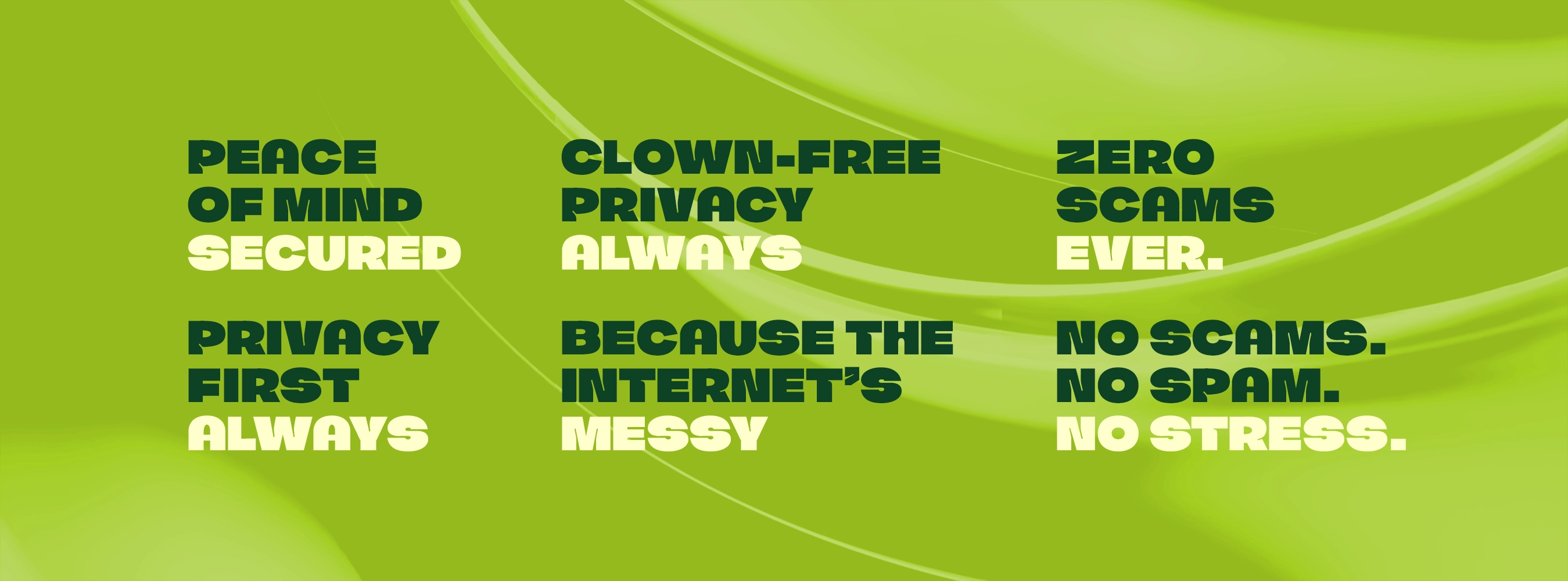

Instead of talking like an IT department, Exo talks like a person.
Most competitors either overwhelm users with technical languor or oversimplify complex issues. Exo sits in the middle, explaining security clearly and confidently without sounding corporate. The goals wasn’t to be casual for the safe of being casual. The goal was accessibility.
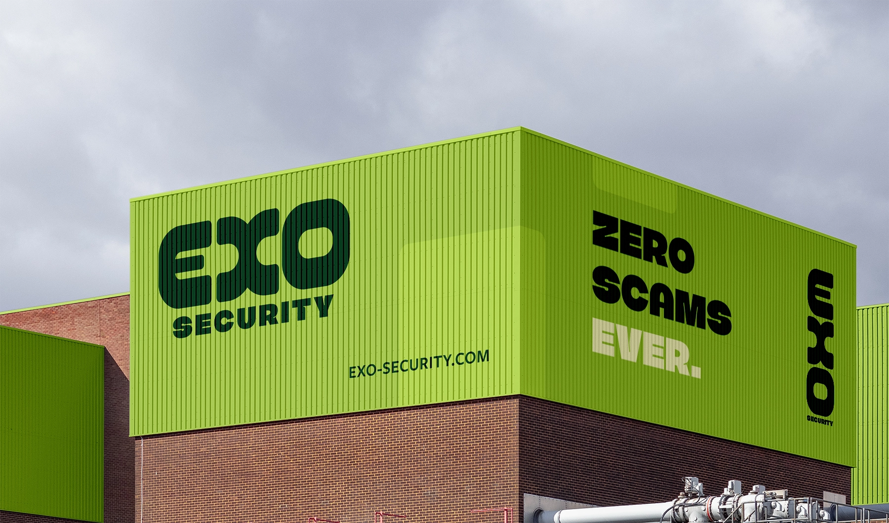
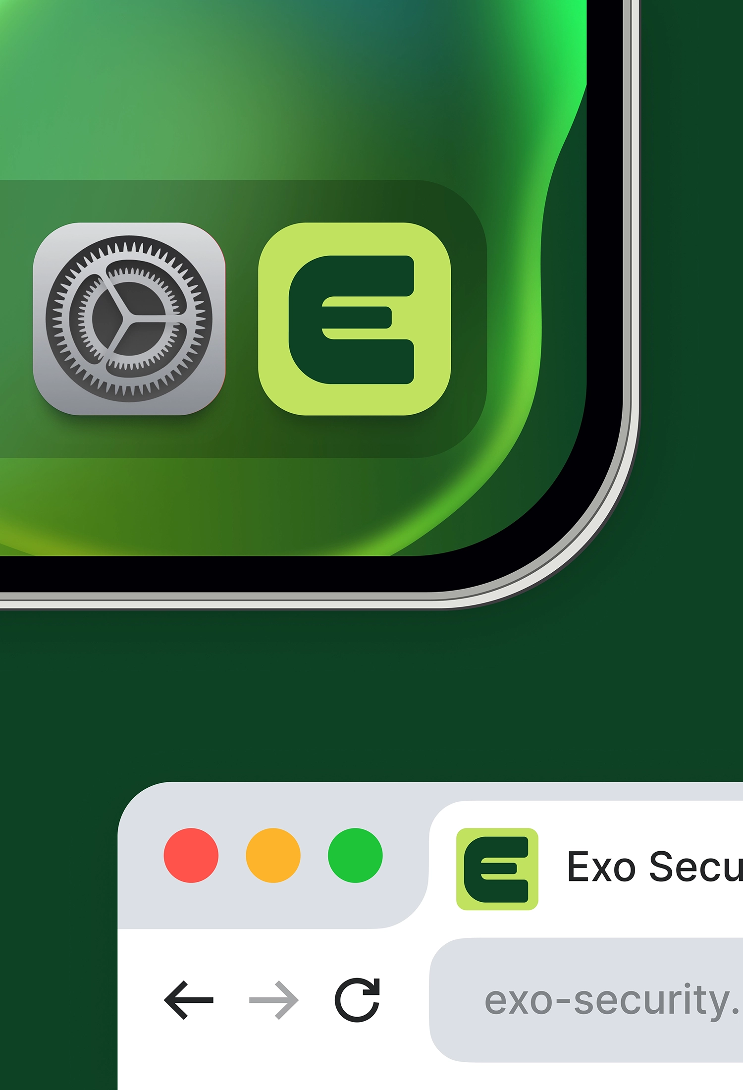
The bold custom word mark reflects the brand’s confidence. And the geometric forms feel direct and unapologetic , matching the straightforward tone of voice.
The colour system combines neon green which represents innovation and forward momentum, and dark forest green which grounds the brand in stability and trust. Together they create tension and balance.


The resulting identity positions Exo as a confident, approachable alternative to traditional cybersecurity brands.